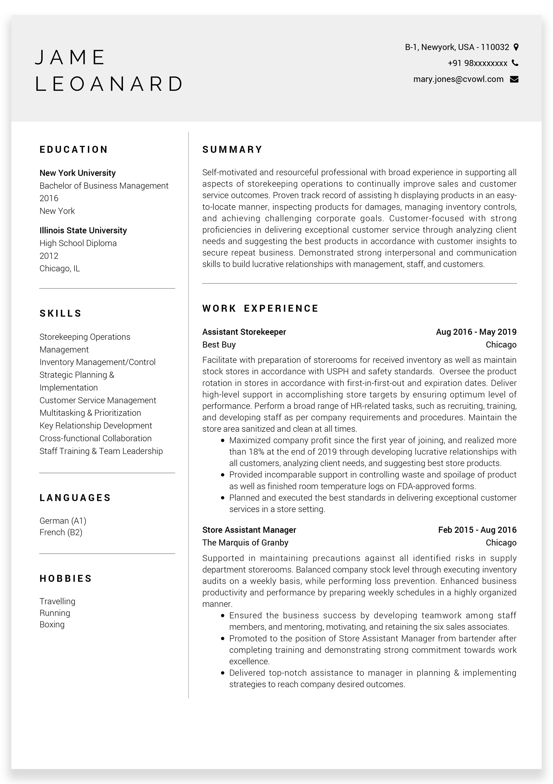
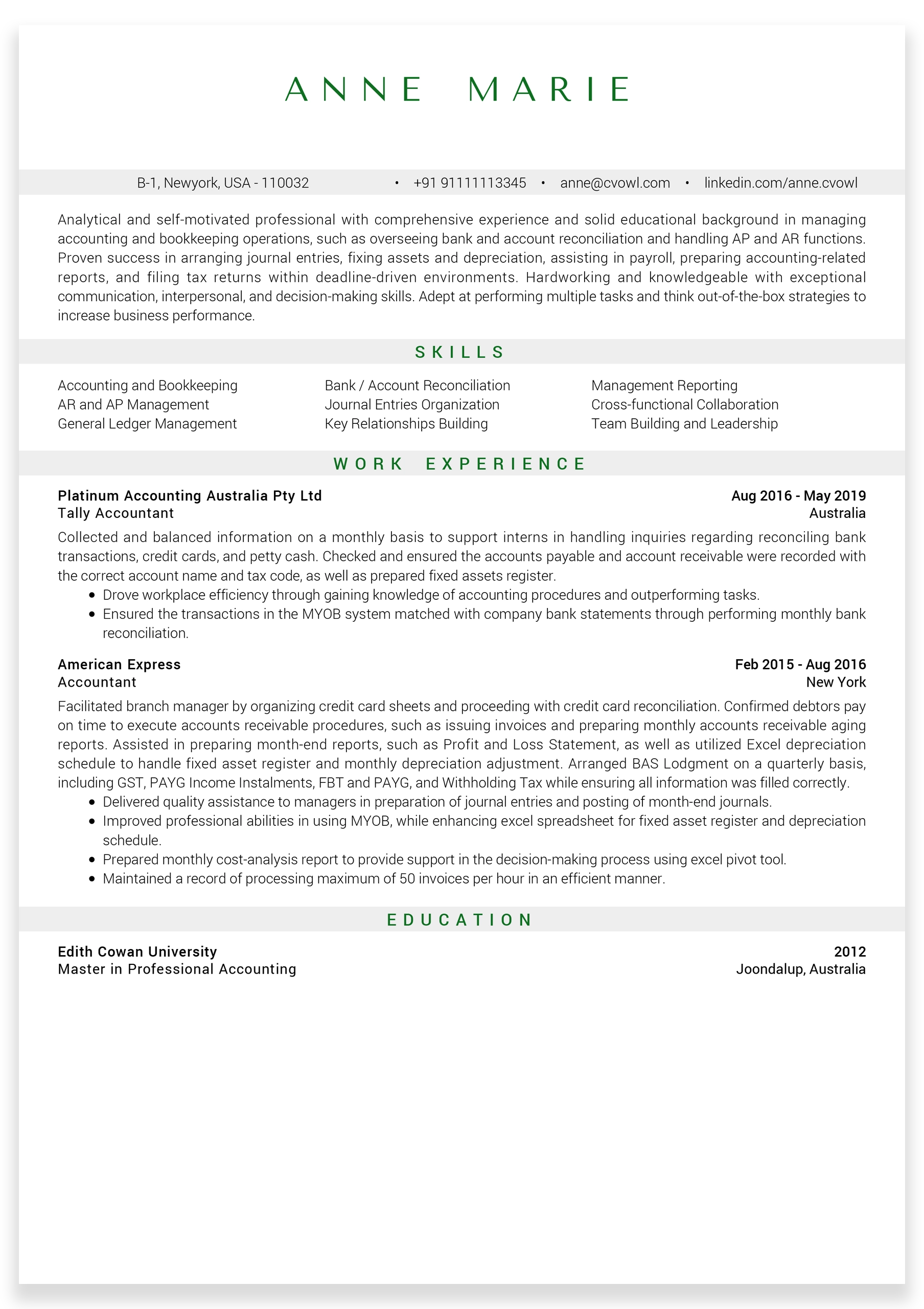
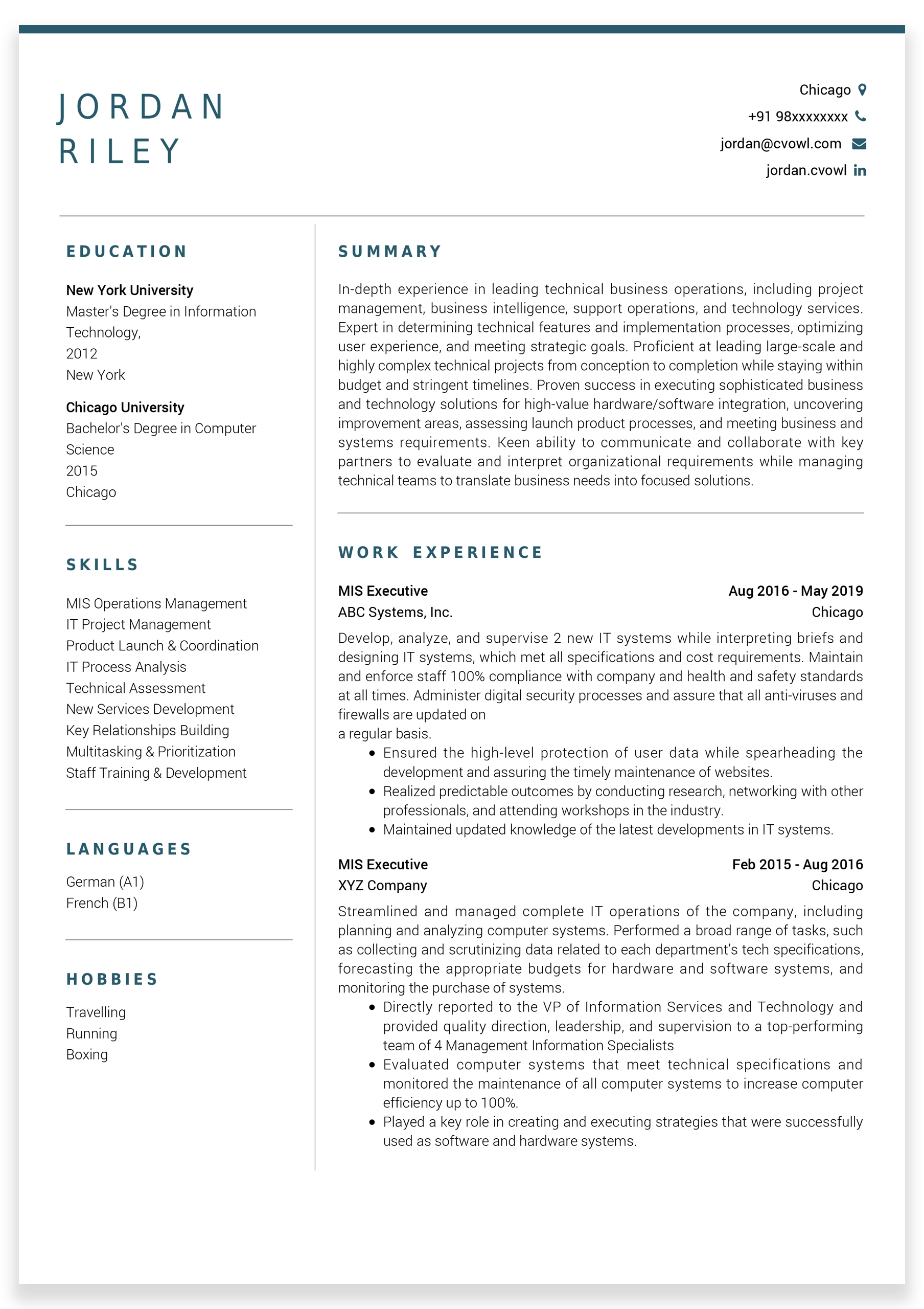
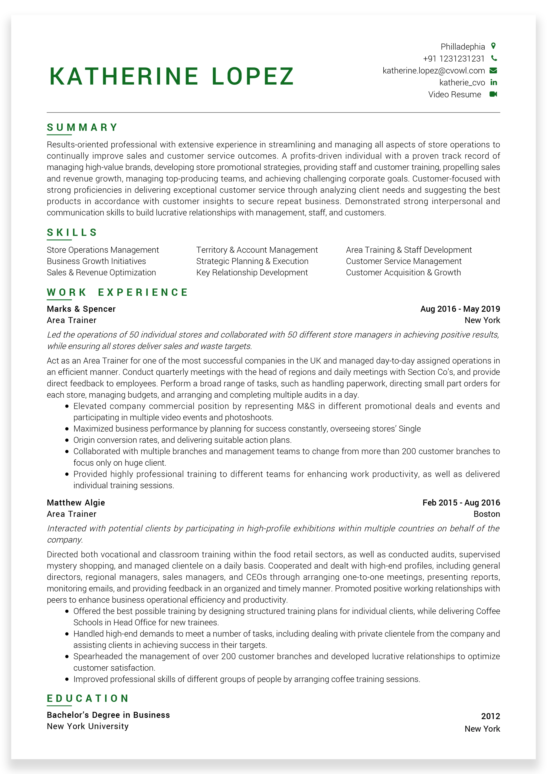
Infographic Resume


With the influx of eagerly waiting fresh graduates into the system every year, it is becoming all the more difficult to get hold of your recruiter’s attention Amidst all of this, however, it is possible to be out of the box within a second with an ‘Infographic Resume’.

The most important aspect of an Infographic Resume style is that you may or you may not require it. If you can manage to design a perfectly synchronized Infographic Resume, then there is nothing like it. But you need to be really sure about your skills in graphical representation of facts and data. If you have no prior experience, get someone who knows how to pull it off.

What is a functional resume?

An Infographic Resume is a graphical representation of all your educational qualifications, work experience, your skills and your productivity capabilities by way of visual graphics and cues.

These visual graphics may contain charts which shows how you have developed or made progress at learning a particular job-oriented productivity or a skill set over the years. It may also contain circular graphics to showcase which skill you possess and in what approximate percentages. Your recruiters will gather information about you within seconds and that is a great advantage.

This particular style is based on a simple principle. The principle of self quantification. The Infographic Resume brings everything about you down to its bare minimum i.e., in terms of numerics and percentile.

It is quite a sound approach by both the recruiter as well as the applicant. When it comes to your point of view, it is essential for the recruiters to know how valuable you think you are. Infact, to be honest with you, it is one of the primary questions asked by the recruiters when you go for a job interview. So, why not give your recruiters the answer to a very valid question before you even land on that precious job interview.

Why not visit our blog telling you about “How Recruiters Shortlist Candidates ?


Is it a potential replacement of your traditional Resume?

Now it is time for us to discuss whether an Infographic Resume has the ability to replace your otherwise Traditional Resume which uses texts and lines to describe and separate various aspects about you in your application.

Well, first of all, it is important for us to understand that an Infographic Resume may not be acceptable by all hiring firms, companies or organisations. Plus, it depends what your vocation has been, your field of work or the kind of industry you are likely to work in.

Nowadays, all major firms and organisations use an ‘Application Tracking System’ which reads texts, process it like an available set of information and then matches it with the keywords put into the system by the employers or the recruiters. If and when, on a majority basis, your application consists of keywords related to the specific job you are applying for, the ‘Application Tracking System’ short-lists your application and presents it directly to your employers or recruiters.

Come On.. Lets Discuss it one to one
“We would love to help you create your CV. You can whatsapp us on +91-9716366366 and consult an expert for free”

When it comes to an ‘Infographic Resume’, the ‘Application Tracking System’ may not work as efficiently as it would work in case of a text based application/Resume.

Don’t be disheartened as yet, because you can still use it for a specific set of employers as and when they may require from you. It is highly recommended though that you keep one of these prepared with yourself beforehand.

You can send your ‘Infographic Resume’ along with your Traditional Resume or under certain circumstances such as when your employer is already aware of who you are (For Example: inter-departmental hirings).

You may also send this particular style of Resume to large tech companies like Apple, Microsoft, Tesla and Google where standing out in the crowd is perhaps a greater consideration than a page filled with the same old super qualified literature resumes they are so used to receiving on a daily basis.


Dos and Don’ts

Now that you are interested in making yourself an ‘Infographic Resume’, you should know that making one of these, is actually a bit quirky.

  • You should have within your grasp, the knowledge and understanding as to how to put data, facts and information by way of tables, circles and charts etc. which would convey the facts accurately.
  • Since, infographics is the easiest way for your potential employer to judge your psyche and confidence levels, you should be very cautious as to what information you put in and in what way.
  • Learn how to and where to use graphical elements like charts, tables, circles etc. Not everything goes with every piece of information you are willing to express.
  • Being overly appreciative of yourself can look a bit too much. Keep numericals realistic as they can be easily misunderstood as a little too snobbish.

Illustration - It might fancy you to put in a 90 to 99% ability in ‘client handling’ in your pie chart, but in reality you have a job experience in the backdrop of a company.


Hacks to create your own ‘Infographic Resume

The good news is that there are tons of websites such as Parchment, Venngage, Piktochart and Cool Infographics filled with amazing templates, which you should definitely try if you wish to create your own Infographic Resume.

Then there are all time favourite softwares like Adobe Photoshop and Adobe Illustrator, too! These softwares, unlike some of the above mentioned websites with pre-installed templates, can create your own customized ‘Infographic Resume’ down to its last minute detail.

Here’s a list of pointers you should keep in mind before you jump right in to create your own ‘Infographic Resume’ -

  • Colour palette -
  • Before you begin creating your own set of infographics make sure you have a clear idea as to who your target audience is.

    Illustration 1

    If you are trying to apply for a job which involves parental care then it is better if you avoid using the colour black altogether.

    Illustration 2

    If you are applying for an executive level job, then keep those colours as matte as possible.

    Be very careful on how you present your information on those infographics. Try not to overuse colours and make it look childish at the end of it. It is better if you stick to some of those basic colours like blue, grey and maybe faded purple. You should also keep in mind the job position you are applying for (as mentioned above in the illustrations).

    Check out the video
    “We would love to help you create your CV. You can whatsapp us on +91-9716366366 and consult an expert for free”

    Use the following tips to choose the correct colour scheme for your infographics -

    • Make sure to use bright colours for your pie charts and bar charts. But keep the text showcasing numbers within those dim colours like white and grey.
    • In case you wish to highlight a particular graph or a chart, do not forget to lit it up by using bold and bright colours. This use of colour is certainly going to grab your recruiter’s eye balls.
    • Use different colours for two different trajectories in the line infographics.
    • Choose a contrasty colour palette. Remember black ink on a white piece of paper looks sharp and not the other way around.
    • As I have mentioned earlier, pay very close attention to your target audience.
    • It is easier on the eyes, if you choose two predominant colours and then diffuse the same two colours and use them to create a bar or a pie chart. In that way, the colour scheme of a single infographic remains parallel.

    There are websites like Coolors and Visme which have in-built colour schemes for you to choose from.

  • Keep it professional -
  • Do not pour out all your creative instincts on your resume. Try to keep it professional because after all it is your resume. Avoid using jazzy and beware of using infographics informally.

    You should understand that an “Infographic Resume’ is going to be out of the box kind of an application to begin with. You would not like to over use those stylish fonts or over the top bold colours.

    Keep your head down and ask yourself a simple question i.e., whether you being the recruiter would have laughed at this resume or whether you would have felt interested. Be honest when you reply!

  • Uniform flow of thought -
  • Hopefully, you will be able to judge that there is a possibly an advantage as well as a disadvantage associated with this point.

    The advantage is that, with the help of a properly framed ‘Infographic Resume’, you stand a chance of clearly demonstrating before your potential employer that your thought process is clean and without any clutters.

    You are supposed to maintain a hierarchy of information. If you are a fresh graduate, keep your academic excellences at the top. Similarly, if you have been working in the job industry for some time now, put in your job experiences and area specific expertise and other adopted skill sets you may have acquired over your tenure as a top most priority.

    Uniformity would also mean that certain vital information is supposed to pop up to the eyes more than other sets of information. For better understanding of this point, try to highlight those skill sets which are closest to the job specifications you are applying to.


Conclusion

Simplicity is the key here! The less you look desperate, the better it will be for you. Needless to mention that your choice of fonts, colour scheme and how you put in all the requisite information without messing it up would be the key to your success with ‘Infographic Resume’.


Written By :
Abir Ghosh
Career Expert at CV Owl

Your CV or resume is your first impression for any company. With the help of CV Owl, you can get a well-structured CV and your time will be saved. Everything on your CV should be written in a formal manner and in a precise way. You have only 20 seconds to impress your recruiter with your CV, make the best out of it. Visit our series “The HR Talk” where we help you know everything about your job interview from the recruiters.

Try CV Owl as we help you furnish a fully-formatted in a chronological order resume on our RESUME BUILDER or cover letter. You can also try our CV REVIEW SERVICE, through which you get a CV writing expert reviewing the insight of your CV and advising you so that you can make your CV stand out.

Want an expert opinion?
Mention your Email ID
Attach Resume/Coverletter/SOP